![]()
About
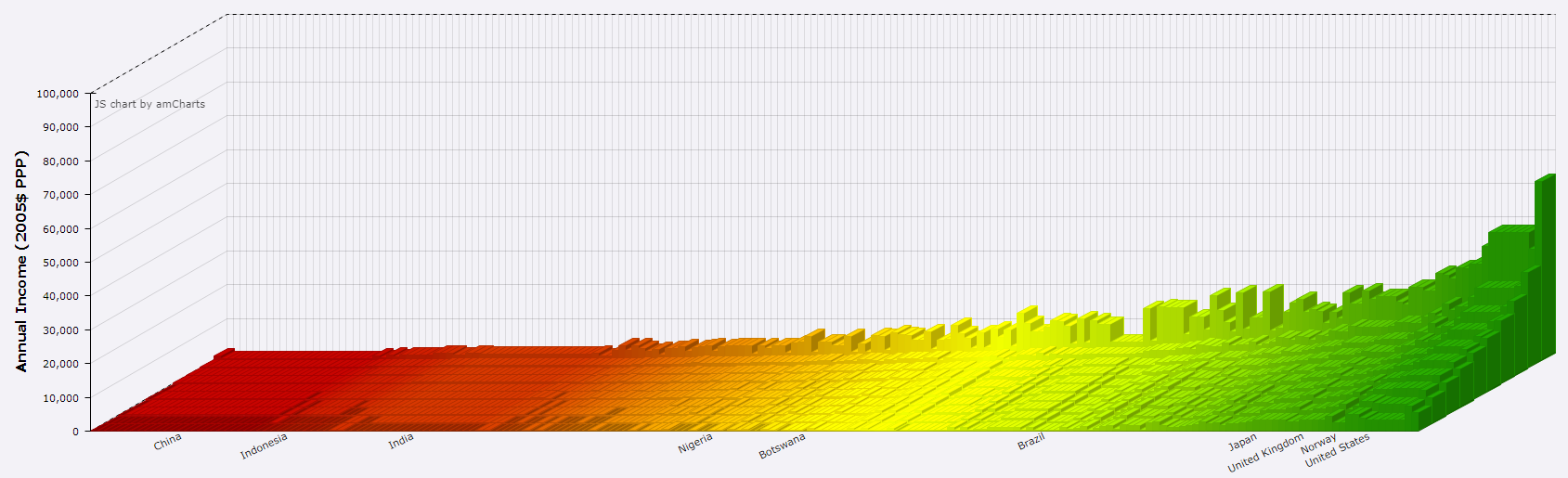
Here we use PPP-adjusted data on real incomes from the Global Consumption and Income Project to build an interactive visualisation demonstrating the changing shape of global income since 1980.
Click here to go to the graphs
You can also download the data here in xlsx or csv formats.
Taller blocks correspond to higher incomes. Countries with larger populations are assigned more blocks. Colours correspond to how rich the country is in 1980, with poorer countries shaded red and richer countries shaded green. Countries are ordered according to mean income level in each year, while holding colours fixed from the 1980 levels. Therefore with these figures we can see inequality within and across countries over time as well as changes in average income.
This work was created for The CORE Project. CORE is an open-access, interactive ebook-based course for anyone interested in learning about the economy and economics.
Visualisations created using amCharts
Bob Sutcliffe designed the representation of global inequality in this figure. A first version was published in: Sutcliffe, Robert B. 2001. 100 Ways of Seeing an Unequal World. London: Zed Books.
Contact
Questions? Comments? Concerns? Get in touch using jackblun@stanford.edu.
Created by Jack Blundell
Countries included in GCIP
Afghanistan, Albania, Algeria, Angola, Argentina, Armenia, Australia, Austria, Azerbaijan, Bahamas, The, Bangladesh, Barbados, Belarus, Belgium, Belize, Benin, Bhutan, Bolivia, Bosnia and Herzegovina, Botswana, Brazil, Bulgaria, Burkina Faso, Burundi, Cabo Verde, Cambodia, Cameroon, Canada, Central African Republic, Chad, Chile, China, Colombia, Comoros, Congo, Dem. Rep., Congo, Rep., Costa Rica, Cote d’Ivoire, Croatia, Cyprus, Czech Republic, Denmark, Djibouti, Dominican Republic, Ecuador, Egypt, El Salvador, Estonia, Ethiopia, Fiji, Finland, France, Gabon, Gambia, Georgia, Germany, Ghana, Greece, Guatemala, Guinea, Guinea-Bissau, Guyana, Haiti, Honduras, Hong Kong SAR, China, Hungary, Iceland, India, Indonesia, Iran, Ireland, Israel, Italy, Jamaica, Japan, Jordan, Kazakhstan, Kenya, Korea, Rep., Kyrgyz Republic, Lao, Latvia, Lesotho, Liberia, Lithuania, Luxembourg, Macedonia, FYR, Madagascar, Malawi, Malaysia, Maldives, Mali, Malta, Mauritania, Mauritius, Mexico, Micronesia, Fed. Sts., Moldova, Mongolia, Montenegro, Morocco, Mozambique, Myanmar, Namibia, Nepal, Netherlands, New Zealand, Nicaragua, Niger, Nigeria, Norway, Pakistan, Panama, Papua New Guinea, Paraguay, Peru, Philippines, Poland, Portugal, Romania, Russian Federation, Rwanda, Sao Tome and Principe, Senegal, Serbia, Seychelles, Sierra Leone, Singapore, Slovak Republic, Slovenia, South Africa, Spain, Sri Lanka, St. Lucia, Sudan, Suriname, Swaziland, Sweden, Switzerland, Syrian Arab Republic, Taiwan, Tajikistan, Tanzania, Thailand, Timor-Leste, Togo, Trinidad and Tobago, Tunisia, Turkey, Turkmenistan, Uganda, Ukraine, United Kingdom, United States, Uruguay, Uzbekistan, Venezuela, Vietnam, West Bank and Gaza, Zambia
Countries from the above list with population size under 750,000 are omitted from the graphs. The following countries included in GCIP are omitted from the graphs due to concerns over data consistency: Singapore (before 2000), Uganda, Bosnia and Herzegovina (from 1996), Georgia (from 1996), New Zealand. These countries constituted less than 0.1% of world population in 2014.
Updates
20th April 2019 - While there have been data revisions to GCIP, we are for now retaining our original data in the construction of graphs here. We cannot extend the time series beyond 2014 and will keep this under review.